This week we talk about the cover art for your podcast. We’re talking about your podcast artwork, how to make it, what to think about when designing it, and all the things you need to know to make the one that is going to be best for your show.
WHY DO YOU NEED GREAT COVER ART?
Your podcast cover art is the first thing your potential audience will see when choosing your show. This is how they go about deciding between your show and someone else’s show.
The ability of the artwork to grab the attention of the right people for your show determines the popularity of your show. Your artwork also conveys what your show is about it. It tells people what they should expect on today’s show.
COVER ART HELPS WITH FINDABILITY
It contributes to the findability for future repeat listeners. For the people that already have decided they want to watch your show, the artwork is how they find it. It’s how they go quickly sift through all the other shows and say, “Oh yeah, this is the one I want to listen to again.”
This is why it’s so important to think about the design of your podcast cover art and not just throw up something quickly.
IT TELLS PEOPLE WHAT YOUR SHOW IS ABOUT
Your cover art needs to help show people what your show is about. That’s first and foremost. It’s all about context. In a very quick image (1000×1000 pixel square, which on your phone might be as small as a quarter,) you’ve got to let people know what the show’s about. That way if they’re looking for something specific, they find you.
Related: Click here to get your FREE Podcasting 101 Starter Kit
If your show is about technology, your cover has to convey that with that little square image. It should be able to have a title that’s legible, something that says this is a show about technology. It should have imagery that supports that as well, so if you didn’t have a chance to read it, but you just glimpsed at it, you would have a sense of the type of show you’re listening to.
YOUR COVER ART CLARIFIES YOUR MESSAGE
That’s context. You also need clarity. Clarity means that with that image, you should be very clear on what the show is going to be about.
In other words, maybe it’s a tech show and you have it in the title, but you suddenly have a bunch of baseball imagery. Though it might be a good idea in terms of how the style. Your style might be in the fun things you want to bring personality-wise to the show.

However, it’s confusing to your audience. They don’t know if it is a baseball show, a tech show, or if it’s about tech within baseball. The simple things you do can be confusing.
Make sure you have clarity of message in the images you use as well as the words you use in your title. It is important. You have to be able to convey what your show is about.
RELATED: Do you know what you want your show to be about? If you need help making that decision, check out these 10 podcasting ideas for beginners!
YOUR COVER ART CATCHES YOUR AUDIENCE
The second thing you have to answer is the question “Is this show for me?” For example, if you have a tech show but that tech show is for beginners versus advanced, that needs to be conveyed in your cover art.
You can use the word “For beginners,” or you can do something with the imagery to convey that. One of the most popular books out there is the series of books that says ‘such-and-such for dummies’. It could be Investing For Dummies. It could be Technology For Dummies or PowerPoint For Dummies.
That series is very effective because everyone who sees that brand in that title knows this is for beginners. This is for people starting out where we’re going to cover the basics. We’re going to understand what it’s about.
DON’T MISLEAD POTENTIAL LISTENERS
Identifying what your show is about in your cover art was number one, but number two is it has to convey is the show for me, because if it’s not, I’d rather sign up for the show. It’s okay if that means that you’re sending people away because you’re sending the wrong people away.
They’re going to stop listening anyway. They might be a little mad that you trick them into listening to your show for ten seconds and then they turned it on and realized, “This wasn’t what I thought it was at all.”
DOES YOUR COVER ART MATCH YOUR SHOW’S CONTENT?
You have to have clarity, not just in what your show is about, but also who it’s for. Another example of this is that sometimes it’s not just for beginners or for experts. Sometimes it’s for a very specific group of people. We have a marketing shows, but marketing could be for anybody.
However, if you say “For Entrepreneurs,” I’m sure those lessons can be applied to anybody, but you know who you’re speaking to when you’re talking. I’m specifically going to gear all my personality and ideas towards this set of people because that’s what I want to help.

Though the content might be applicable to everybody, the people that you’re hoping to have as customers know that you are specifically talking to them. It helps you with the conversation. Conveying that in the cover is something that’s going to help you bring more people in that are exactly for you.
RELATED: Build your personal brand with the Content Marketing Starter Guide.
PODCAST COVER ART SHOULD BE PROFESSIONAL
The third point to ask is “Is it any good?” Now, as I can imagine, you’re probably wondering, “How is a square image of my show going to convey to people that the show is any good?”
Think about this. Let’s say you have two shows to choose from. On one show’s cover art it is obvious someone took an iPhone selfie and they just added a label, the text that says the show title with no other editing.
Compare that to an image that was taken by a professional photographer. It’s crisp and well-lit, and the color is correct. The design of the background is well thought out. It has a prominent color palette. It has text such that the font was obviously designed in a way that stands out.
You add all these elements together. You’re going to say, “Okay, well obviously one show was an amateur show and the other one is a professional show.”
YOUR IMAGERY CONVEYS YOUR INTENTIONS
If you’re looking for advice, you might choose a more professional show. Why is that? If you’re looking for help with something, especially for the expert type shows, you’re going to be someone who seems like they’ve put this together in a thoughtful way as opposed to a hobby.
There are plenty of people who start podcasts as hobbies. That’s great, but that’s going to come through in your imagery.
If that’s not your intention, then you need to think about how you are designing the show. The packaging matters just like a book cover for a book. If someone just drew on it with crayon, wrote the title out, and then put it on the bookshelf versus a book that was professionally designed as a cover, people will judge that.
DOES YOUR COVER ART TURN LISTENERS AWAY?
People will judge the book literally by its cover and choose the one that seems more professionally written because they’re guessing if you put the attention into the cover, maybe you’ve taken the time to put the attention to what’s inside as well.

If you couldn’t even take the time to design the cover, you’re probably not following through with the content being professionally built either and making it valuable.
The question “Is your show any good” can be answered sometimes with just the cover art alone. Give yourself the chance to not be judged right off the beginning by having bad cover art. Choose something that gives you some professionalism.
LOOK AT YOUR COMPETITORS
One of the judgments of that is how you position yourself versus your competition. Anytime someone searches for a show, you’re going to be compared to other people and to other shows.
If you look at the shows in your category, figure out what are some of the normal best practices that convey that this is the right subject matter for the show.
For example, I looked up “Stock Market.” I found a bunch of investing shows. Some of them, with both the imagery and the words, were conveying, “We give investing tips, some of our advice and the ways to think about it.”
The others were obviously shows that were built saying, “We are giving you some behind the scenes of what we do,” more like friendly advice. That position is different. I want to go with the authority in the space, not someone who’s looking at this as a hobby. I want to know that you can back up what you say.
YOUR COVER ART SHOULD CONVEY CREDIBILITY
If you’re in a suit and have some kind of credibility stamped on your cover in some way, shape, or form, or you’re supported by a professional brand, whatever that is, that credibility will come through because of how you’ve positioned it.
If I’m comparing you to other competitors, I’m going to look at what stands out. Does this person pop off the page, and does it speak to me?
If everything is gray backgrounds with an image of the person’s face and a title that says “Investing”, that all kind of looks the same. However, if one of them is a bright background and says “Investing Ideas For Today’s Entrepreneur”, that might stand out to me.
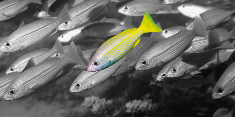
Especially with the color pop, my eyes are going to be drawn to that. I’m more prone to actually read what the title says. Sometimes you have to catch their eye and then deliver what the imagery is. Think about how people actually search for things, where their eyes are going, and how you get the attention.
Again, we’re just talking about a small square image. That is how people decide on your show. You have to give yourself the chance to be found and the one way to do that is to really think about these ideas of how you’re representing yourself with your image.
FIND THE RIGHT RESOLUTION FOR YOUR COVER ART
To that point, there are a couple of things that we’ll just tack on here. In terms of making it look good, having something well-designed and having crisp imagery is a part of this. Again, you want professional photography, but also crisp imagery that is the right resolution. In other words, it is not pixelated. It’s not blurry.
You can hire a professional photographer. If you’re going to be doing a show, you might as well have the assets you need, because you’re going to be promoting this on social media, on your website, and in your cover art. Get a professional photographer to take pictures of you.
That will be well used in something like cover art. Also, in the graphic design, you need to fix the coloring and find the right shading so it’s not just your face, a solid background, and words. Have someone that puts some thought into what that looks like overall.
FOLLOW BEST PRACTICES FOR COVER ART
Lastly are specifications. I’m not going to give you what the specs are for your exact podcast, cover art, and the things to avoid or not avoid. However, you should be Googling this.
Go to Apple cover art specs and they’ll tell you, “This is how many pixels it needs to be considered and to show up. These are the sizes you need for resizing. These are the words you can and can’t say on the cover. Here are the images you can or cannot use on the cover.”
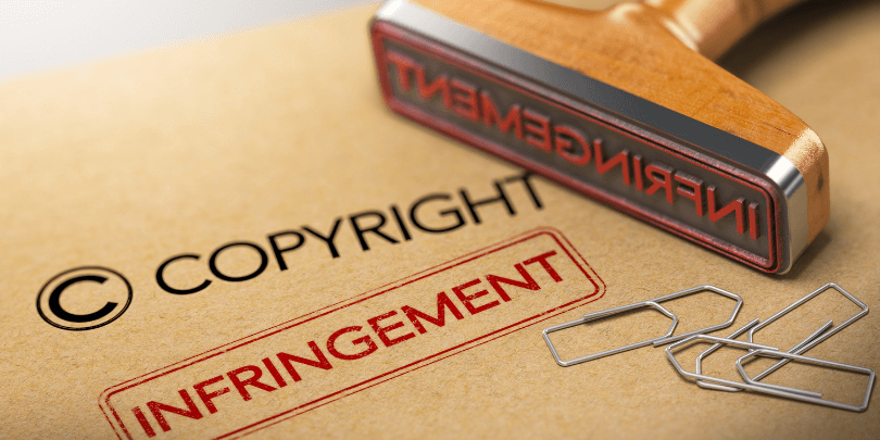
Obviously don’t plagiarize or use cover art that you’re not approved to use because you don’t have the copyright, the trademark, or whatever the thing is, you don’t have the rights to use their information.
Go through all that because what’s the point of putting all the effort into designing this thing if you’re just going to get banned when you go to submit? Follow the specs. Google that and you’ll figure that out. Don’t get all the way to the finish line and then stop flat at the end.
GOOD COVER ART IS WORTH THE INVESTMENT
No one is talking about this. A lot of people will tell you, “Oh, just go into a graphic design tool. Go to Canva, grab a background, pop your picture on it, throw your title in, and you’re good to go.”
Yes, it is that easy to do, but sometimes that is going to be the difference between your show looking like an amateur show and like a professional show. I’ll tell you, when I did the search for stock market podcasts, it was very obvious.
I won’t pick on them and give you the title, but instead of being like most of the other shows (either just words or words in a professional photo), it was a picture of a beach. The words had nothing to do with investing the title. It was along the lines of “Seize the day” or something like that.
Then you get to the description and it was said, “Personal investing tips.” I thought, how is this even connected? I was so confused.
Sure enough, I go look at the show and it had lasted maybe twenty episodes. The last episode was said, “This is the end,” because they didn’t keep the show going. Why? Because people weren’t listening.
They didn’t put the effort into the design of the cover, which backs up the point that they probably didn’t put the effort into the actual content of the show either to commit to doing this long-term.
Think about that. You are being not judged, but you are being selected from a pool of options. Put yourself in the best position to be chosen by the people that are looking for a show like yours.
CONNECT WITH BRANDON
Coaching Advice: brandsonbrands.com/coach
Instagram: @brandonbirkmeyer
MORE ADVICE AND INTERVIEWS
If you’d like more content about how to build your personal brand, check out my free Content Marketing Starter Guide.
- Don’t want to miss the next thought leader interview? Subscribe to the free B-team Insider Newsletter! And don’t forget to leave a rating and review on iTunes.
Talk soon!
4 Ways To Build Your Podcast Brand
Start Building Your Reputation Today. Take your knowledge out of your head and turn it into an influential podcast brand. Dramatically increase your industry reputation, reach a global audience, gain a passive income and impact people’s lives all over the world. Let me help you create and launch your podcast, grow your audience, and build a highly influential personal brand – the easy way!
Here are 4 ways that I can help you become a known leader in your industry: